
Top 8 EV Fleet Reporting Metrics
EV fleet readiness and cost hinge on eight KPIs — SoC, energy/mile, charging behaviour, uptime, battery health and £/mile for one dashboard.

If I run an EV fleet, I need van tracking solutions to track charge, energy, charging time, downtime, battery condition and £/mile - not fuel-led KPIs.
In simple terms, this article says one thing: an EV fleet works well when I can see whether vehicles are ready to leave, how much power they use, where charging time is wasted, and what each van costs to run. The eight metrics are SoC, energy use per mile, route efficiency and range use, charging time, charger use, vehicle uptime, battery health, and total running cost.
A few numbers make the point fast:
- Around 80% of fleet energy demand can be met by depot charging
- Smart off-peak charging can cut annual energy cost by about £2,825 per van
- Many electric vans sit at about 3 to 4 miles/kWh
- Charging can account for 72%–75% of vehicle downtime
- Public rapid charging can cost about 16–24p per mile, while off-peak depot charging can be about 4–8p per mile
So if I want a dashboard that helps day to day, I’d focus on:
- Readiness: Is each vehicle leaving with enough charge?
- Efficiency: How much energy does each mile use?
- Charging use: Are chargers busy, blocked, or underused?
- Battery condition: Is battery wear cutting range or charge speed?
- Cost: What is each vehicle costing in £/mile and £/month?
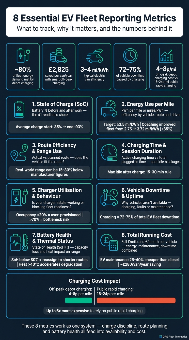
8 EV Fleet Metrics vs Diesel KPIs: What to Track & Why
EV Fleet Dashboard in Power BI

Quick comparison
| Metric | What it tells me | Main use |
|---|---|---|
| State of Charge (SoC) | Battery level before and after work | Dispatch readiness |
| Energy Use per Mile | kWh used for each mile | Vehicle and driver efficiency |
| Route Efficiency & Range Use | Whether routes fit the vehicle’s usable range | Route planning |
| Charging Time & Session Duration | How long vehicles charge and how long they block chargers | Depot flow |
| Charger Use & Charging Behaviour | Whether chargers are used at the right times | Site planning and tariff control |
| Vehicle Downtime & Uptime | Why vehicles are not available | Fleet availability |
| Battery Health & Thermal Status | Capacity loss and heat issues | Battery life and route fit |
| Total Running Cost | Full cost to keep each EV on the road | Cost control |
Put simply: I’d use these eight metrics together, not on their own, because charge, route fit, battery wear and cost all feed into each other.
Why EV Fleets Need a Different Reporting Dashboard
A diesel fleet dashboard usually focuses on fuel spend, mileage and servicing. That often does the job when the main aim is simple: keep vehicles on the road.
EV fleets work a bit differently. An EV can be mechanically fine and still not be ready to leave if it hasn't charged enough. That's why the most useful dashboards connect availability, charging, route performance, battery condition and cost. Those are the inputs a fleet manager uses every day to dispatch vehicles, schedule charging and keep costs under control. The first metric to watch is state of charge.
For UK fleets, this link matters even more because overnight depot charging does so much of the heavy lifting. Around 80% of commercial fleet energy demand can be met through depot charging during overnight or scheduled stops, which makes vehicle readiness rate - the share of vehicles that reach the minimum state of charge needed before dispatch - a key start-of-day KPI.
Cost changes too, and timing is a big part of it. A van covering 20,000 miles per year on smart off-peak charging costs about £1,200 a year in electricity, compared with about £4,025 for an equivalent diesel van. That's a saving of around £2,825 per vehicle per year. So it isn't enough to track total energy use. You also need to track when charging happens if you want to see those off-peak savings.
And there's another wrinkle: charger use matters just as much as charging timing.
A van that looks efficient on a motorway can use much more energy in city traffic. Stop-start driving, frequent stops and cold weather can all cut into real-world range. That makes energy use harder to predict unless route performance data sits alongside state of charge in the same dashboard. If range drops without warning, battery condition is often the next place to look. That's why state of charge comes first.
1. State of Charge (SoC)
State of Charge (SoC) is the battery’s remaining usable energy, shown as a percentage and used as a readiness check.
Operational impact
UK electric van research found the average battery state at charge start was 35% and at charge end was 93%. That gives you a clear picture of how overnight depot charging shapes day-to-day readiness.
Set a minimum departure SoC for each route to take the guesswork out of dispatch. For example:
- 60–70% for longer routes
- 40–50% for short urban work
This simple rule can cut last-minute vehicle swaps. It also has a direct effect on charging spend when vans leave with too little charge.
Cost visibility
SoC data can show where money slips through the cracks. If vehicles keep leaving the depot undercharged, drivers may have to use rapid public chargers during the route. And those sessions usually cost more than overnight depot charging.
Track SoC at departure and return. That makes it easier to spot which routes drain the battery too far, and whether emergency top-ups are eating into the savings off-peak charging was meant to bring.
Charging efficiency
Not every vehicle needs a full charge every night. A van coming back at 65% SoC may not need to plug in straight away, but without SoC visibility, depot staff can’t tell.
Use SoC to decide which vehicles should charge first. Give charger access to vans below the fleet threshold, and let higher-SoC vehicles wait. That can cut queues, free site capacity and limit demand charges. It also helps when SoC is tied to route planning, so dispatchers can assign work based on both location and available charge.
Asset health insight
SoC trends over time can also point to early battery issues. If one vehicle’s SoC falls much faster than others on similar routes, that should be investigated.
Try not to run vehicles at the extremes of SoC as a matter of routine. Keeping most vans in the 20%–80% band can help support battery life.
Once SoC is visible, the next question is how much energy each mile uses.
2. Energy Use per Mile
Energy use per mile tells you how much energy a vehicle needs to travel one mile. It’s usually shown as miles per kWh or kWh per mile. For example, 200 kWh over 800 miles works out at 0.25 kWh/mile, or 4.0 miles/kWh.
In mixed day-to-day driving, many electric vans land at around 3 to 4 miles/kWh. That’s about 0.27–0.35 kWh/mile. Larger vans, or vans spending more time at motorway speeds, may drop nearer 2.5 to 3 miles/kWh.
Operational impact
This metric is handy when you want to compare vehicles, routes and drivers. If one van uses more energy per mile than another, the reason is often pretty simple: driving style, payload, or the kind of route it’s doing.
Driver behaviour can shift the numbers by a lot. One white-label van tracking solution with a coaching programme tracked a fleet’s efficiency from 2.75 miles/kWh up to 3.72 miles/kWh over 11 months (July 2022 to June 2023). That was a 35% improvement from the same vehicles, with no hardware changes. That’s a big jump from coaching alone.
A benchmark also helps. For instance, setting a target of ≥3.5 miles/kWh for medium vans on mixed urban–suburban routes gives fleet managers a clear line in the sand. If a van keeps falling short, you can step in before weak routes, heavy loads, or poor driving habits push charging costs up.
Cost visibility
Once you attach your electricity tariff to kWh per mile, the figure turns into cost per mile. The formula is simple: cost per mile (p) = electricity price (p/kWh) ÷ efficiency (miles/kWh).
At 28p/kWh and 3.5 miles/kWh, the cost is about 8p per mile. That sits well below the 12–15p per mile often seen with petrol and diesel equivalents.
This also matters for reimbursement. HMRC's Advisory Electricity Rate gives a flat business EV mileage rate, but actual kWh per mile shows whether that rate is below or above the vehicle’s true running cost.
Charging efficiency
There’s another useful check here. Compare the energy logged by the charger with the energy suggested by miles driven. That gap can show losses you’d miss otherwise.
If chargers record 250 kWh delivered but vehicle consumption data suggests only 220 kWh reached the wheels, then about 12% is being lost through charging inefficiency or pre-conditioning. Track that by charger location and patterns start to show. One site may be wasting more energy than another, or a certain charging habit may be adding cost mile by mile without anyone spotting it.
Asset health insight
A slow rise in kWh per mile on like-for-like routes is often an early warning sign. It can point to issues such as under-inflated tyres or wheel misalignment.
Say a van returned 3.8 miles/kWh in its first year but now manages only 3.0 miles/kWh on the same jobs. That’s a clear sign it needs checking.
Track this at the vehicle level. Then compare it with route efficiency so you can see whether the drop comes from the route itself or from the van.
3. Route Efficiency and Range Utilisation
Once you've looked at vehicle-level efficiency, the next step is the route itself. This is where you find out whether the plan is wasting time, miles or battery charge.
Route efficiency looks at how closely an EV’s actual trip lines up with the planned route for distance, time and energy use. Range utilisation shows how much of the vehicle’s available range is spent on productive mileage, without pushing the battery too low.
Day-to-day operating conditions can cut effective range by 15–30% compared with manufacturer figures. Payload, cabin heating or air conditioning, stop-start driving, speed, weather and terrain all play a part. So a van rated for 230 miles may deliver only about 165 miles when it’s fully loaded and working in hard conditions. That’s why route planning needs to come from real operating data, not brochure numbers.
Operational impact
Route efficiency helps you spot where vehicles miss time windows or drift away from the planned path. That gives you a chance to change schedules or reassign vehicles before small issues turn into daily headaches.
If one van keeps running late, look at planned versus actual distance and journey time. Sometimes the driver isn’t the problem at all. The route may simply need to be rebuilt.
This also feeds into vehicle assignment. Older EVs often lose usable range over time, so it makes sense to move them onto shorter runs and keep longer regional routes for newer vehicles with more battery capacity.
Cost visibility
When you connect route efficiency to cost data, weak planning shows up in £ per mile.
Say a badly planned route forces a driver to stop for a public rapid charge halfway through the job instead of using lower-cost depot charging. The dashboard should show the extra cost of that detour clearly, in pounds and pence, against the trip.
It also helps to group routes by type, such as:
- urban delivery
- regional
- trunking
Then compare £ per mile across those groups. That makes it much easier to see which route types are giving you the best return and which ones are quietly draining money.
Charging efficiency
Poor route efficiency often sits alongside aggressive range use. And that usually leads to avoidable mid-route charging.
When vehicles keep arriving with less than 10–15% SoC, drivers get pushed towards costly public fast charging. That adds direct energy cost and unplanned downtime at the same time. Track mid-route charging, and split energy use by public versus depot charging for each route, so the pattern is easy to see.
One simple fix is to set minimum departure SoC targets by route type. For instance, a full-day multi-drop round may need at least 80% SoC before the vehicle leaves the depot. You can also change stop order so the vehicle is nearer to charging locations when the battery starts to run low.
The key idea is simple: treat charging as planned work, not as a last-minute rescue job.
Asset health insight
Routes that often push batteries below 10–15% SoC, or rely on several rapid charges in a day, can wear batteries faster. Urban stop-start work with frequent rapid charging can speed up capacity loss compared with smoother suburban driving, even when total mileage is about the same.
When you line up route patterns with battery health data, you can see which routes are hardest on the battery. That gives you something concrete to act on. If the same route keeps ending with low-SoC arrivals, then the route design, departure target or vehicle assignment probably needs to change.
If the route plan looks fine but vehicles still spend too long at charge points, the next metric to check is charging time and session duration.
4. Charging Time and Session Duration
Charging time is the period when the battery is actively drawing power. Session duration is the full time the vehicle stays plugged in, including any idle time before charging starts and after it ends. The difference between the two is idle time. That’s why charger-level timing matters so much.
Operational impact
For most EV fleets, the main limit is dwell time - the period when a vehicle is parked and available for charging. Compare session start times with planned departure times and you can quickly spot vehicles that are missing the overnight charging window.
That matters because missed charging windows usually lead straight to missed readiness targets. And once readiness slips, departures often slip too.
Cost visibility
Match session duration with tariff data to spot public rapid charging that could have been avoided. If a big chunk of weekly charging is taking place on public rapid chargers during afternoon runs, that’s a clear cost problem that session-level reporting can bring into view.
There are usually two simple fixes:
- Move routine charging into off-peak hours
- Stagger session start times to cut depot peak demand
Charging efficiency
One useful efficiency measure is the ratio of active charging time to total session duration. If that ratio is low, vehicles are staying plugged in long after charging has finished. In plain terms, the charger is blocked and nothing useful is happening.
A clear team rule helps here. For example, set a maximum idle time after charge completion of 15–30 minutes so drivers and operators know what good looks like.
It also helps to track how many sessions end near the operationally best SoC - often 70–90% before a morning shift - instead of pushing to 100% every time.
Repeated rapid charging and long sessions at high SoC can also hint at problems for the battery-health metric that comes next. Once session time is in view, charger use starts to show whether the site is running well.
5. Charger Utilisation and Charging Behaviour
Where the last metric looked at session length, this one tells you if your charger estate is doing its job.
Operational impact
Charger utilisation shows how much of your charging capacity is being used. Charging behaviour shows when and where drivers plug in. Put the two together, and you can see whether your setup supports fleet readiness or gets in the way.
A good place to start is with fleet-wide bottlenecks. High occupancy paired with low energy delivery often means a vehicle is still sitting on the charger after charging has finished. That blocks the bay and slows things down for every other vehicle waiting to plug in.
As a rule of thumb, occupancy below 20% can point to over-provisioning at a site. On the flip side, rates above 70% for long periods usually signal a bottleneck that can hit vehicle readiness and on-time departures. If you also track session count per charger per day, you can spot congestion before it turns into an operational headache.
Cost visibility
Keep an eye on the share of kWh bought on off-peak depot tariffs, along with the average charging cost per mile by site. If public rapid charging starts to climb while depot chargers sit unused overnight, money is slipping out of the fleet.
Charging efficiency
Compare plugged-in time with active charging time. If that gap is large, vehicles are taking up bays after charging has already ended. In plain terms: the charger looks busy, but it isn't doing useful work.
It also helps to watch aborted-session rate and the delay between plug-in and charging start. Both drag down charger efficiency and can add hidden delays to day-to-day operations.
Asset health insight
Frequent aborted sessions, lower power output, or communication errors on one charger can be early signs of a hardware issue, even before the unit fails outright. When you track those patterns across the fleet, it's much easier to spot faults early and plan maintenance before throughput takes a hit.
If utilisation looks balanced but vehicles are still missing departures, the next metric is downtime.
6. Vehicle Downtime and Uptime
Even if your charging setup is well run, that still doesn’t mean every vehicle is ready when you need it. Uptime and downtime reporting shows where availability is slipping, whether that’s due to charging, maintenance, or faults.
Use (Uptime ÷ Total time) × 100 and classify each vehicle state clearly: in service, available, planned charging, unplanned charging, maintenance, fault, or idle and undercharged. That split matters. Without it, a vehicle waiting for a charger can look exactly the same as one that has just finished a route.
Operational impact
Break downtime down by cause so you can see what’s eating into availability: charging, maintenance, or faults.
Research into fleet charging behaviour found that charging time made up 72%–75% of total downtime, which made it the biggest cause of lost availability in EV fleets.
Cost visibility
Tag each downtime event with a cause code, then report the knock-on cost in £ per vehicle per month. That should include:
- missed work
- overtime
- replacement-vehicle costs
This turns downtime from a vague ops issue into something you can track in pounds and pence.
Asset health insight
Link downtime data with battery health and maintenance logs to spot vehicles that need attention. If one vehicle keeps dropping out of service, the pattern often shows up here first.
If downtime keeps rising, the next metric to check is battery health.
7. Battery Health and Thermal Status
If downtime keeps climbing, SoH and thermal data can tell you if the battery is behind it. Battery health shows whether an EV can still do the job its SoC says it should. State of Health (SoH) compares usable capacity with the original factory rating and shows the result as a percentage. So if a van started with a 75 kWh pack and now delivers 67.5 kWh, its SoH is 90% - and that missing 10% cuts into range on the road.
Operational impact
As SoH drops, the knock-on effects add up fast. A van that used to finish a 250-mile mixed route on one charge may now only cover 200–220 miles. That matters for planning. Higher-health batteries should go to longer routes, while lower-SoH vans are better suited to shorter, more predictable work.
It also pays to watch for odd temperature spikes and fast SoH decline. Sustained heat above 40°C speeds capacity loss.
SoH isn't just an uptime measure. It's also a direct cost measure.
Cost visibility
SoH trends make battery degradation easier to plan for. If you map capacity loss against mileage, you can estimate when a vehicle's range will fall below the minimum needed for its core routes. That gives teams time to budget for replacement or move that vehicle to lighter work before it becomes a problem.
Charging efficiency
Cold or worn batteries charge more slowly. Telematics can compare actual charge power, in kW, with expected charge power, making it easier to spot when battery health or temperature is slowing fast charging and stretching turnaround times. Where schedules allow, slower AC charging makes sense. DC fast charging is better kept for top-ups that the operation actually needs.
Asset health insight
When you compare SoH curves and temperature history across the fleet, outliers stand out quickly. If one vehicle is degrading faster than others of a similar age and mileage, that's often a sign that something else is going on - a depot issue, a route pattern, or charging behaviour that needs a closer look.
Linking battery health scores with service history gives maintenance teams one view of battery issues as they start to form. Vehicles showing rising thermal irregularities or repeated high-temperature events can then be moved up the inspection queue before they lead to missed shifts. GRS Fleet Telematics links route, idling and utilisation data with battery health trends, helping fleet managers spot issues earlier.
Those same trends feed straight into total running cost.
8. Total Running Cost
After battery health, the last check is total running cost: what each EV costs to keep on the road. It pulls energy spend, maintenance, tyres, insurance, charging infrastructure, telematics subscriptions and downtime losses into one figure. The clearest way to show it is £ per mile or £ per vehicle per month so each vehicle can be compared like for like.
Put simply, SoC, energy use, charging behaviour and uptime only matter if they hit the cost line. That’s why cost works as the final check. If there’s a charging issue, a route problem or battery wear, it should show up in the bill sooner or later.
Operational impact
Total running cost is an operational KPI, not just something for the accounts team. It gives fleet managers a day-to-day way to judge what each vehicle is doing in practice.
A van that uses a bit more electricity but avoids unplanned workshop visits can end up costing less overall than one that charges cheaply but spends more time off the road. That trade-off matters. Looking at energy alone can give the wrong picture.
UK industry data shows EV maintenance is typically 25–40% cheaper than an equivalent diesel over a standard fleet contract. For vans, annual service, maintenance and repair costs average about £420 for an electric model versus about £700 for a diesel equivalent - a saving of £280 per vehicle per year.
Cost visibility
Show the numbers in a ranked table with each vehicle’s mileage, electricity spend, maintenance spend, downtime cost and total running cost side by side. That format makes outliers easy to spot. One glance, and the expensive vehicles stand out.
Keep fixed costs separate from variable costs. Lease payments, insurance and infrastructure subscriptions sit in one group. Energy and repairs sit in another. If you lump them together, it becomes much harder to see what’s changing and why.
UK data puts EV insurance at about £67 per year more, so it should be included in the total cost figure.
| Vehicle | Mileage | Electricity spend | Maintenance spend | Downtime cost | Total running cost |
|---|---|---|---|---|---|
| Van A | 2,400 miles | £168 | £35 | £0 | £203 |
| Van B | 2,250 miles | £142 | £110 | £85 | £337 |
| Van C | 2,520 miles | £189 | £28 | £0 | £217 |
Charging efficiency
Charging mix has a direct effect on total cost. Off-peak depot or home charging costs about 4–8p per mile. Public rapid charging can hit 16–24p per mile. Across a fleet, that gap adds up fast.
The dashboard should show how much charging happened in peak versus off-peak periods. It should also flag charging losses, because those losses push costs up without adding range. That’s dead spend, plain and simple.
Asset health insight
Total running cost only makes full sense when it’s tied back to the asset health data from the earlier metrics. A vehicle with battery wear may charge more slowly, cover fewer miles per session and need more charging stops. Costs start climbing before any fault code appears.
That link matters because high cost is often the first visible sign that something is drifting in the wrong direction. A ranked table helps you find it. A simple chart helps you spot the pattern.
Use ranked tables and simple charts to surface the highest-cost vehicles at a glance.
Visuals and Tables for EV Fleet Reporting
Once you’ve set the metrics, the next job is picking the clearest way to show each one. The aim is simple: one clear visual per metric so every KPI is easy to scan.
State of Charge is easiest to read as a gauge chart for each vehicle, with colour bands set to red for 0–20%, amber for 20–40%, and green above 40%. At fleet level, that same metric works better as a distribution histogram, so you can spot how SoC is spread across the whole fleet.
Energy use per mile fits a ranked bar chart, with a fleet average line laid over the top. That makes it easy to see which vehicles are above or below the norm. Route efficiency is clearest on a map, with routes colour-coded by efficiency band - green, amber, and red based on miles/kWh - plus stop and dwell overlays.
For charging sessions, a table is the most useful format. It should include:
- vehicle ID
- charger
- start and end time (24-hour)
- duration
- energy added (kWh)
- start and end SoC (%)
- charger type
- session cost (£)
It also helps to flag long sessions where very little energy was added. That’s often where wasted time starts to show up.
Charger utilisation across depots works well as a percentage bar chart for each location, paired with a peak-period heatmap by hour and day. You can glance at it and see where chargers are busy, and when.
Downtime and cost are the two outputs fleet managers need to watch most closely. Uptime and downtime suit a stacked bar chart, splitting each vehicle’s time into driving, charging, available, maintenance, and repair. A simple table beside it - showing total downtime hours, category breakdown, and estimated cost per vehicle - makes the financial effect much easier to grasp.
Battery health needs a trend line for each vehicle showing State of Health (SoH) (%) over time, with a threshold marker at 80% SoH. Add event markers for rapid charging sessions or heavy-payload days to show what’s pushing wear along.
The summary below pulls those choices into one dashboard reference.
| Metric | Recommended Visual | Key Data Points |
|---|---|---|
| State of Charge (SoC) | Gauge chart (vehicle); histogram (fleet) | Current %, SoC band, shift readiness |
| Energy Use per Mile | Ranked bar chart with fleet average line | miles/kWh, variance from average |
| Route Efficiency | Colour-coded route map with overlays | miles/kWh per route, stop/dwell time |
| Charging Sessions | Sortable table | Duration, kWh added, start/end SoC, charger type, cost (£) |
| Charger Utilisation | Bar chart + peak-period heatmap | Utilisation %, sessions per day, energy dispensed (kWh) |
| Uptime and Downtime | Stacked bar chart + summary table | Hours by category, downtime cost (£) |
| Battery Health (SoH) | Trend line with event markers | SoH (%) over time, 80% threshold |
| Total Running Cost | Ranked multi-column table | Energy, maintenance, insurance, charging, downtime, total cost |
Use these visual formats as the base for the fleet-wide dashboard build that follows.
How to Build a Fleet-Wide EV Dashboard from These Metrics
Use those visuals as the building blocks for a fleet-wide dashboard. The metrics only start to mean something when they sit in one reporting view, not across separate systems. The goal is simple: one dashboard that brings together vehicle readiness, charger use, cost pressure, and battery health.
Use three reporting cycles: daily, weekly and monthly. Each one should focus on a different mix of the eight metrics. Once the visuals are set, group them by reporting cycle.
Use the table below to match each reporting cycle to the right metrics.
| Reporting Cycle | Primary Focus | Key Metrics | Audience |
|---|---|---|---|
| Daily | Charge readiness | SoC, thermal alerts, overnight charging completion (e.g. 05:30), ready-for-dispatch status | Depot supervisors, dispatchers |
| Weekly | Efficiency and behaviour | Energy use per mile, charger utilisation, session duration, downtime patterns | Operations managers, maintenance leads |
| Monthly | Cost and asset health | Total running cost, SoH trends, route efficiency, range utilisation, downtime patterns | Fleet managers, finance teams |
The daily view should answer one question: which vehicles are ready to go? Flag any vehicle that missed its target SoC overnight, then compare estimated range against planned route distance. That gives depot teams a quick way to spot risk before the first vehicle leaves the yard.
The weekly view is where patterns start to show up. Charger utilisation heatmaps can reveal whether drivers are tying up chargers during peak-tariff hours. Energy use per mile, split by route type - urban, mixed, or motorway - helps you tell the difference between a tough route and poor driving habits. At UK depot rates of around £0.15–£0.25/kWh, shifting sessions away from peak periods can cut weekly energy spend.
Monthly reporting should show the bigger picture. SoH trends, total running cost, range use, and downtime help you judge whether vehicles still match the routes they’re assigned to. To make that work, link telematics, charging, and cost data through the vehicle registration or VIN, so each trip record shows energy used, charging cost, and faults in one place. GRS Fleet Telematics can anchor the vehicle-level data layer, with charging and financial feeds joined via API.
That shared data setup lets daily dispatch, weekly review, and monthly planning run from the same source.
Conclusion
Taken together, these metrics show whether an EV fleet is ready, efficient and under control on cost. EV reporting isn't just a new KPI set. Readiness, efficiency, battery condition and cost now matter more than fuel-led KPIs.
These eight metrics work as one system. Charge discipline, route planning and battery health all feed into availability and cost. If one part slips, the rest tends to feel it too.
UK fleets need local, time-sensitive reporting because charging windows, charger reliability and real-world range all shape cost and service. This isn't theory. It's what determines whether vehicles are on the road when they're needed and whether spend stays in check.
Set ownership, agree targets, and pull telematics, charging and mileage data into one dashboard. Once those measures sit in one place, the pattern behind performance becomes much easier to spot. GRS Fleet Telematics can bring those data streams together so UK fleet managers can turn reports into decisions.
FAQs
Which EV metric should I track first?
Prioritise State of Charge (SoC) and State of Health (SoH) first.
SoC works like a fuel gauge. It gives you real-time data for day-to-day route planning and helps make sure vehicles have enough range for the job.
Once battery availability is covered, SoH comes next. It helps track long-term battery degradation and flags when maintenance or replacement may be needed.
How do I reduce public charging costs?
Prioritise off-peak charging whenever you can. In the UK, peak rates can climb to £0.80 per kWh, while off-peak power often sits between 14p and 28p per kWh. That gap is huge, so moving charging sessions to cheaper hours can cut annual costs by a fair amount.
It also helps to track charging data through telematics. That gives you a clear view of when vehicles are being charged, where money is being spent, and which habits are costing more than they should. From there, you can spot lower-cost charging patterns, factor in the 5% VAT on EV charging, and use smart scheduling to avoid peak-demand charges and charging that doesn’t need to happen yet.
What most often causes EV fleet downtime?
Most EV fleet downtime comes back to charging problems. Failed charging sessions are a big one, often caused by cable faults, parts failing, or communication errors between the vehicle and charger.
Charging behaviour matters too. Leaving vehicles sitting at very high or very low states of charge, or leaning too much on high-power DC fast charging, can wear batteries down faster and increase the risk of unplanned maintenance.